Would you like the convenience of simply typing a letter in your cutting software instead of having to open an SVG file to get the split Regal letter you want?
Now you can. I have taken all the letters I spent many hours on cleaning up, smoothing edges and splitting for you and have put them in the form of a font, plus you get to bonus cuts -- the split Regal awareness ribbon and my split flourish.
I have just finished adding all of my videos to a public Wunderlist list.
They are sorted in alphabetical order by type of video (Comparison, CorelDRAW, Cricut, Cutting Files, Fonts, General, Inkscape, MTC, Process Video, SCAL and Silhouette).
The list is quite long because I have over 160 videos on my YouTube channel and I add more regularly.
If you use Wunderlist, which is a fantastic to-do list manager, you can import my video list into your Wunderlist database so you can easily find videos that can help you learn various techniques.
In this SCAL tutorial, I teach you some cool tips for creating a compound path in SCAL, welding text to frames and I use the rhinestone feature for a fun effect.
I am a visual person and don't do well following written instructions, but I have received so many requests for a written tutorial of this technique that I felt I needed to do this too.
The first thing you need to do is decide on your text and image.
Certain letters work better than others. For example, the letters P, F, C, J, K, T, V and Y don't work very well so you will want to use words that do not have these letters in the middle. Other letters like A, E, G, O and U are also a bit tricky.
Obviously, sometimes you have no choice but to use these letters. This is why it is best to use images that don't have too much detail. In the PANTHER PRIDE example above, the letter T is right in the middle of the word, but it still works well because the image is solid enough.
Notice the gap between the P and R in the 2nd word. That would be a problem if the P were in the middle of the word, but since it's at the end and the image doesn't reach that far, it doesn't matter at all.
You will need to manipulate your letters and image to make it work well.
You can click any of the images below to display larger versions.
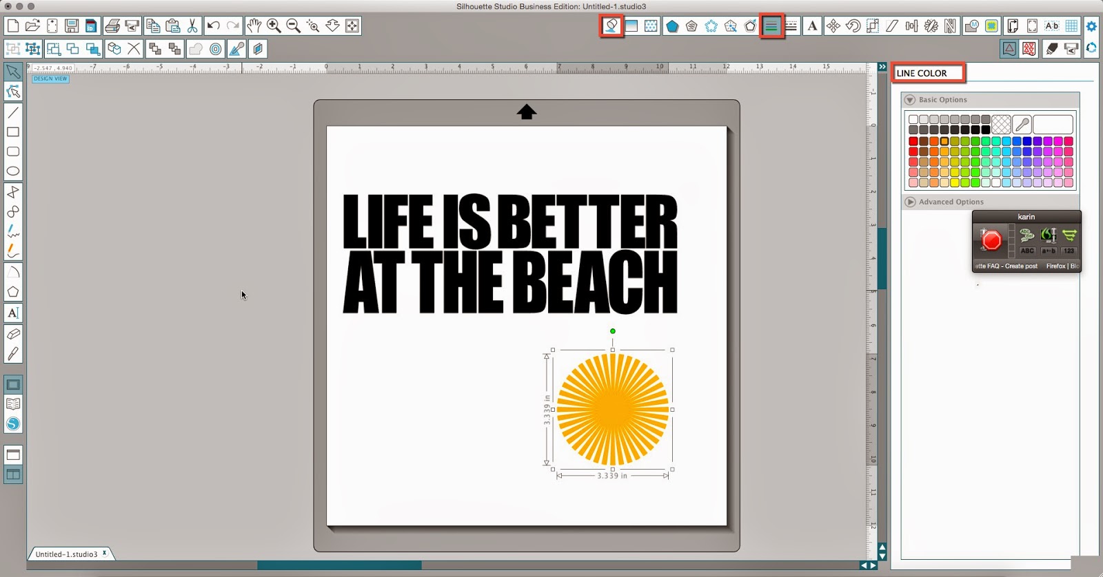
In the image above, I typed my text and then selected my font.
Impact font works very well because it's a nice chunky font that fills in very well.
I stretched out my text as large as possible on my mat to make it easy to see everything.
I need to make sure my letters fit nice and closely together (kerning) and that the lines are nice and snug too.
I have decreased the spacing as much as I can this way. Note that you can achieve what you need with the Line Spacing option, but for the best character spacing, you need to ungroup and manually move your letters for the best placement.
With your text selected, right click and choose Ungroup.
Don't panic when you see this. Just click on another area on your mat.
Just select a letter with your mouse and then using the arrow keys on your keyboard, move all the letters nice and close together. Leave only enough space between the words to be able to distinguish the words.
You can save a lot of time by moving all the letters in one word close together and then grouping the letters in that word and moving them next to the other words.
For example, I moved all the letters in the word "BETTER" close together. I grouped the letters and then moved the word "BETTER" to the left, next to the word "IS". Again, I used the arrow keys on my keyboard to move the word to the left so that I don't move the letters up and down.
Continue until all your letters and words are close together.
Group your top words together.
Group your bottom words together.
Now I turned the grid on so I can line up the left edges of my text. You can see a small gap on the right of the word "BEACH". I need to close that gap by selecting the text and dragging to the right, making that line of text slightly wider.
At this point, drag your text wider or taller until you are happy with the look. It won't look perfect because this is not good spacing for reading. You will need to imagine how the text will look once you add the image.
You might like the look of one line being taller than the other and you might not. This is entirely up to you, depending on what you like.
Once you are happy with the text, turn off the grid and group both lines by selecting the two lines, right clicking and selecting Group.
Now I will need to select the image I want to use. I have decided on using an image that looks like the sun.
I have added fill and line colours to the text and my image so that it will be easier for you to see them once I place the sun on top of the text.
The image above shows you the icons for changing the fill colour, which is the paint bucket, and the line icon to change the colour of your lines.
I have placed the sun on my text, but if you look closely, you will see that there is quite a gap where the 2 letter Ts are in the word BETTER.
I feel the technique will work better with the sun placed in the middle of the text, as shown above.
Before you move on to the next step, be absolutely sure that all of your text is grouped together. The technique will not work if your text is not grouped together.
Make sure your shape is on top of your text. Group your text and the shape.
Copy the grouped items to your clipboard
Paste to make a 2nd set
Move the 2nd set away from the first
Ungroup the first set only once. Remember your text must remain grouped.
Ungroup the second set only once as well.
With the first group selected, open your Modify window. Choose Crop.
Dont' panic
With all those parts selected, right click and choose Group
This is how it will look once it's grouped
With the second set selected, choose Subtract
Don't hyperventilate. With everything selected, right click and choose Group.
It will look like this.
I changed the colour of the sun portion so you can see the parts.
Move the sun portion into place and then Zoom In
Now you can easily move the shape where it should be.
You're done.
You can also follow along with my video. In my video, I also show you how to create registration marks so you can cut the layers separately and line them up once they are cut.


.jpeg)